
THE IGP LOGO
A Symbol of Hope, Faith & Love
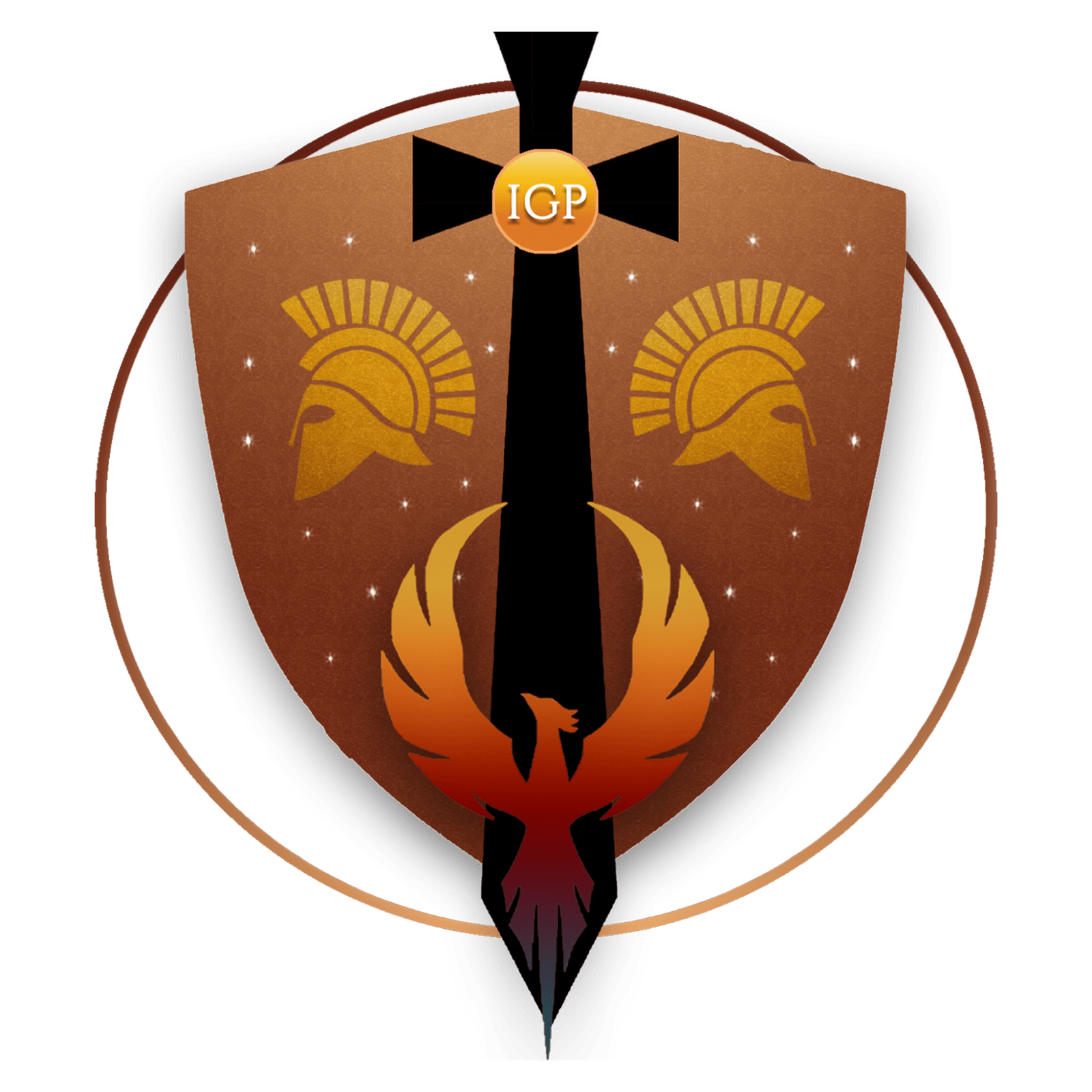
Together, they tell the story of courage, truth, and the unseen battles we all face—and rise from.
This is a decoding of those emblems, from ink to sun.
INK
From pain to something beautiful.
The ink that flows from creators is not ordinary. It flows from the agony of devastation, the stillness of depression, and the heartbreak of loss. It exists to give, to share, and to offer hope into the ocean it becomes before joining the rest of the world.
The ink in IGP’s logo is the color of old blood that reflects a sacred palette of deep meanings. They are:
- The hues of burnt sunrises and sunsets which suggest new beginnings that born from endings.
- New dreams resurrected from wounds that learn why they must exist.
- Tendrils of kindness carried in a lantern which cannot be touched by the rest of the world.
CIRCLE
Boundaries, beginnings, and the never-ending rhythm of creativity.
The logo is enclosed within a circle, representing the importance of:
- Nourishing, supporting, and connecting with one’s inner circle.
- Maintaining personal boundaries with discernment, kindness and strength.
- The infinite creativity that exists in what is past, in the new, and in what will evolve.
SWORD
Boundaries, beginnings, and the never-ending rhythm of creativity.
The logo is enclosed within a circle, representing the importance of:
- Nourishing, supporting, and connecting with one’s inner circle.
- Maintaining personal boundaries with discernment, kindness and strength.
- The infinite creativity that exists in what is past, in the new, and in what will evolve.
HELMETS
Masks of courage, strength and divine protection.
The double helmets represent:
- The Italo-Corinthian helmet (galea or marten) resembles a mask and was worn by great warriors in ancient Greece and Rome—for identification of each other and to protect their heads in battle.
- The three art elements on the helmets stand for the Holy Trinity, and can therefore be seen as wearing the armor of God. The 13 sunrays above each helmet were created to honor: The Miracle of the Sun (the date of the event) and The Last Supper (Jesus and His 12 disciples)
- The symbolism of mirrors—The dark (what is unseen), The shadow (what is hidden) and The light (what is seen). This further illuminates how we choose to use, express and communicate with our voices—writing, poetry, spoken word, art, photography, music, and creative expression.
STARS
Fortitude, faith, and family.
The 26 stars honor the courage to face trials, and the peace, harmony, and hope that comes from building something lasting for the creative community. The 13 stars on each side symbolize:
- The gematric number of the Hebrew name for God: YHWH (Yehowah / Yahweh)
- Unconditional love bursting into constellations of everything good.
- The 26 letters of the alphabet which also represent every first, middle, last or anonymous letter in our Ink Gladiators’ names no matter which corner of the world they came from.
QUILL
Responsibility through words.
The quill is used to signify:
- The immense power, weight, and intention of words.
- Its transformation into a sword of compassion wielded not for war, but for healing, appreciation and love.
- The ability to touch hearts, change minds, and awaken souls by inspiring them to rise with the multicolored wings of a Phoenix from the ashes when words from the depths of love become reality.
SHIELD
Protection, gentleness and strength.
The shield represents:
- The courage of the warrior—to guard the vulnerable, defend the defenseless, and offer refuge in the chaos of battles.
- The presence of safety, not just for others but also for oneself.
- The ability to hold space for kindness, softness and humility while wearing the discerning shield of a warrior.
SUN
Light in the darkness.
The Sun symbolizes:
- The greatest hope of all—the resurrection of Jesus Christ.
- His Light guiding us through uncertainty and shining on every path.
- The 24 hour cycle of the Earth which connects us to all time zones, a reminder of how even the day and night unite across the world.
THE FOUNDER'S NOTE
Before there was a press, there was a lot of prayer. IGP began with a dream, raw and skilled talent, hard work, and a firm decision to walk away from the trap of working for someone else's dreams without first trying to start mine. There was a deep longing to also support a few people in the community who had once played a major role in my journey's beginning. When I started posting my poetry, I did not know at the time that they would become the rain for the seeds of my purpose. And when I started IGP, I did not know where it was going to take my heart and I, except I wanted to know where it wanted to go. Even on days when I had nothing but silence, my hands worked, and my ink wrote soundless songs. When I designed its first logo in early August 2019, it reminded me that even heavy battles can leave behind the strength to create beauty. IGP has not been about publishing for the world. It was about creating a safe home for those whose voices expressed through words, art and creativity might have felt too much, too real, or were simply overlooked. It was about realizing that the threads between writers, artists, and creatives all had a reason to connect. Thus, it evolved to become a home for the outcast, the missing pieces, the adrift, the new, the recovering, the hopeless, the unloved—and most of all, for the ones who felt invisible, but seen here. IGP became a gift to them first, before I noticed it was also mine because I had been too busy building it when I lost everything. Tears are its bricks. Stones thrown are its undefeated foundation. Seeds that died to bloom are its unparallelled beauty that found their way out of the dirt. When I held out my open hands in prayer, a garden of breathtaking flowers revealed themselves. Flowers are not always mine as you will notice in IGP's Library—some are a legacy we hold forever, and some are wildflowers tended to by their own gardeners. IGP has always had room for everyone. It stands with those who see, listen, and speak when others can’t.
I remain at your service,
Reena Doss
BEHIND THE LOGO
The Ink Gladiators Press logo was ink felt before it was designed. In the earliest stages, when I first began exploring what IGP could become, Shruti Sharma was the one I chose to share the fragments of my dream. She saw the first version of the logo, and said, “Full steam, ahead, fraaand!” which added to my determination to keep moving forward.
Later, during one of the loneliest, uncertain, and most defining stretches of IGP’s journey, I was grate ful for Ismet Diab and Miriam Otto who seemed to want to be part of what I was building, which is why I discussed many of my plans and ideas with them over WhatsApp & Instagram conversations. I welcomed their feedback on some of my rough drafts, asked them for their honest opinions, and shared my progress on the new log. To me, it wasn’t just a logo, it was a symbol of deep faith, resilence earned, as well as my loving respect for the global community of creatives itself. I later decided to use the second version as IGP SHIP's emblem.
This is why the logo, in all its elements, is not only a representation of IGP’s spirit, but has witnesses—no matter what path they walk on now—to the courage, belief, and solidarity that helped shape it.
With gratitude,
Reena Doss
to immortalise the hearts of warriors on life’s battlefield.”